Ep. 8: Spacing & Grids
My Figma Design Journey.

Welcome to my blog! I am Oluwasegun aka (engrshege).
Founder & CEO: @StackTribe
𝐔𝐝𝐞𝐦𝐲 𝐅𝐢𝐠𝐦𝐚 𝐂𝐨𝐮𝐫𝐬𝐞: Complete Web & Mobile Designer in 2023: UI/UX, Figma, +more by Andrei Neagoie & Daniel Schifano.
𝐄𝐩𝐢𝐬𝐨𝐝𝐞 𝟖: Spacing and Grids
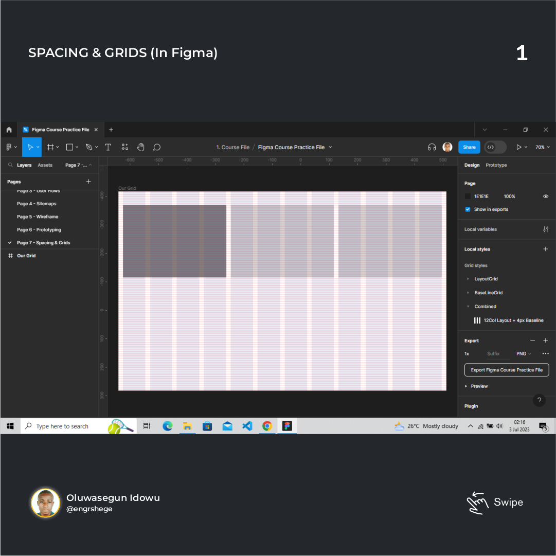
1. Spacing & Grids (In Figma)
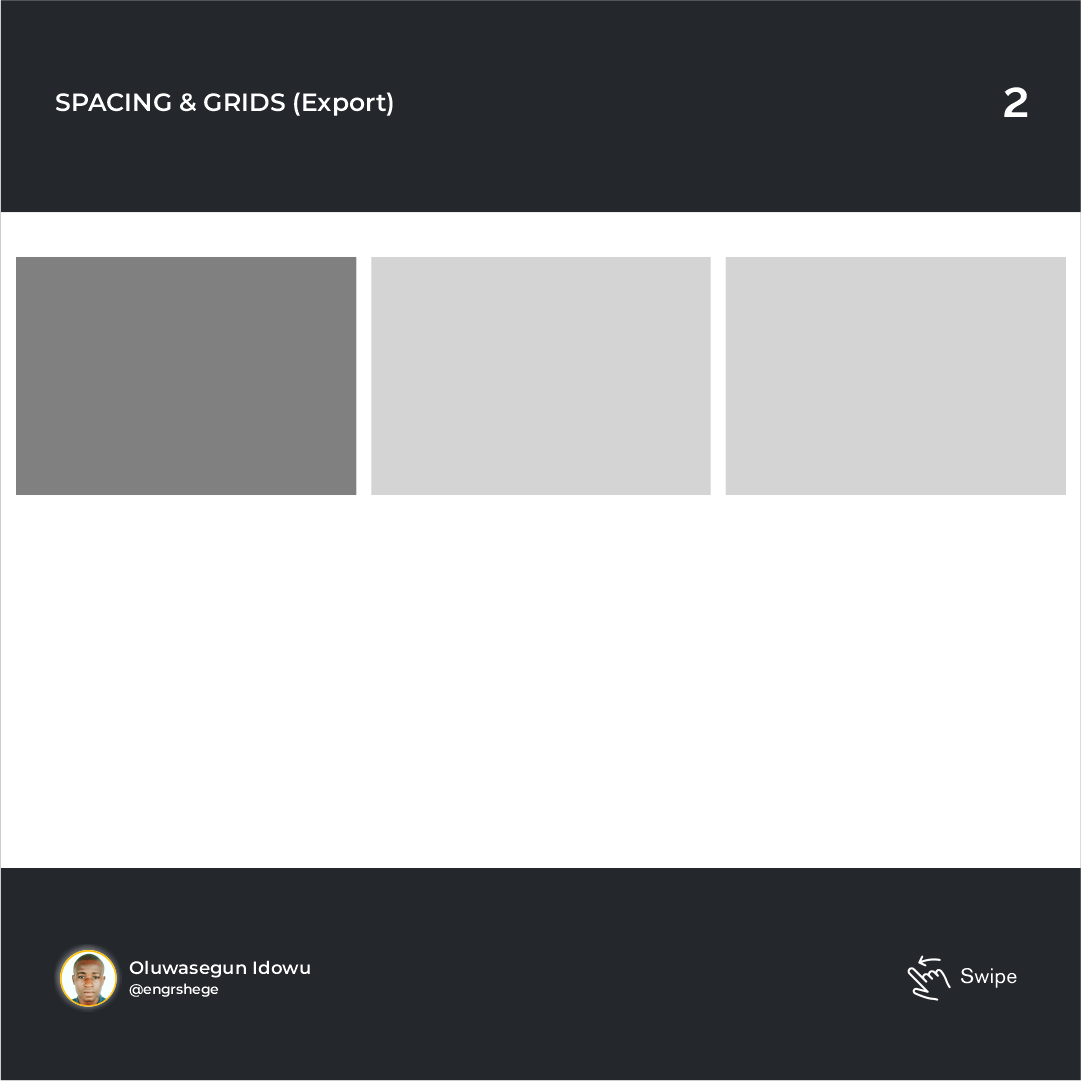
2. Spacing & Grids (Export)
A Grid is a structure comprising a series of lines that divides the page into columns. We have vertical and horizontal lines structured to help designers arrange content on a page. Originally, the Grid came from the print design. But they are applied in a lot of places like; Book Shelves, Town Planning and a lot more.
History
Since the early days, grids were used to help aid readers in reading. The Renaissance era had a profound impact on grid systems. Many artists strived for a perfect geometry.
The Grid we know and use today is very much tied to Swiss design.
Some important terms related to this Episode:
- Base Units: This is what defines what every single measurement will be. The instructor suggested an 8px base unit because it makes scaling a variety of devices easy. Most screen sizes are divisible by 8. All UI elements should be measured in increments of our base unit. This helps with things like; clear alignment, consistency and hierarchy.
All Grids are made up of three key things: Columns, Gutters and Margins.
Types of Grid:
Manuscript Grid: Vertical + horizontal lines
Column Grid: Columns in verticals.
Modular Grid: Columns in both verticals & horizontals.
Baseline Grid: Horizontal lines. This is usually used in typing fonts with;
Heading - 48px, Sub-Heading - 24px & Paragraphs - 16px. The instructor advised setting the baseline grid to units of 4px.
Responsive Grid & Breakpoints.
Fixed Grid: As the frame is adjusted, the Grids and the content within it remain fixed while the margin sizes get decreased or increased. Fixed grids aren't used as much anymore.
Fluid Grid: They are measured in percentages, so the column and the content of your grid will shrink or grow depending on the size of your screen.
Breakpoints: These are boundaries set in place for display on different devices such as;
Small/Mobile - [width: 375px(min)-600px(max)],
Medium/Tablet - [width: 600px(min)-899px(max)],
Large/Laptop - [width: 900px(min)-1,199px(max)] and
Extra Large Screens - [width: 1,200px(min) and above].
Grid Guidelines
Rule #1: Your element must always sit on some number of columns.
Rule #2: Your element should never be left in the gutters.
Rule #3: Your outside column is not for padding.
Rule #4: Know when and how to use Full bleed elements. Ensure it is well-communicated to the development team.
𝐌𝐲 𝐢𝐧𝐬𝐢𝐠𝐡𝐭 𝐨𝐧 𝐭𝐡𝐢𝐬 𝐄𝐩𝐢𝐬𝐨𝐝𝐞:
- Although I have come across Grid in other design software before now, this episode helped me learn a lot about the history of Grid, the types of Grids, and how to create and work with Grid on Figma.
𝑻𝒉𝒆 𝒋𝒐𝒖𝒓𝒏𝒆𝒚 𝒈𝒆𝒕𝒔 𝒃𝒆𝒕𝒕𝒆𝒓...
#Figma #ProductDesign #UIUXDesign #UIUX #UIUXCourse #Grid #GridSystem #Udemy #UdemyCourses #ZTM #ZeroToMastery #DocumentingMyTechJourney #BuildingMySkillset #TechSkill #SkillSets #ProductDesigner #EngrShege #ES


