

Udemy Figma Course: Complete Web & Mobile Designer in 2023: UI/UX, Figma, + more by Andrei Neagoie & Daniel Schifano.
Episode 13: Accessibility
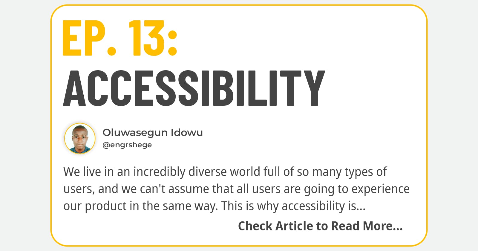
What is Accessibility?
We live in an incredibly diverse world full of so many types of users, and we can't assume that all users are going to experience our product in the same way. This is why accessibility is so important.
If a person can't use your product, you have failed them. An accessible product is one where all your users can enjoy it. Unfortunately, when we design products, we usually design with the majority of users in mind, which are users who do not experience any difficulty in using any type of product.
In most cases, there is very little insight into designing individual components that will work for every user. Nobody ever thinks about the user who has functioned only on one hand or user who has trouble with hearing, or the user who has visual impairments.
Accessible design aids in creating a better experience for everyone. It could be for someone who has a permanent disability or maybe a temporary disability and even a situational impairment.
Contrary to popular belief that accessible design is sacrificing the visual quality of your product, it does make it better for every single user.
Some Applications of Accessibility are:
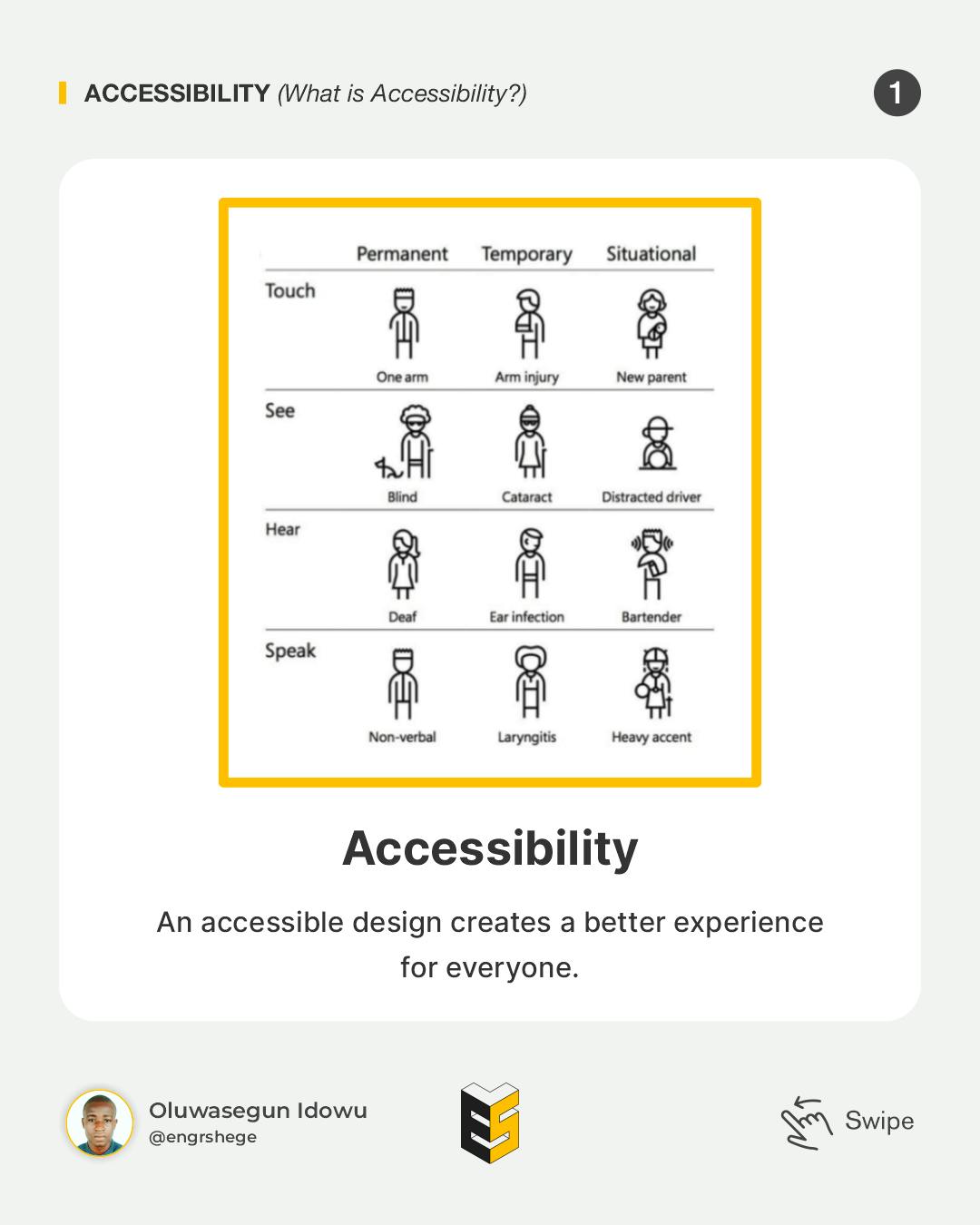
Ramps and Sloped Curbs
Let's take a moment to think about our world, think about ramps or sloped curbs, they have been designed to help those in wheelchairs get around. This isn't the only use though, think about where it is been used by parents with strollers, people making deliveries with trolleys, people bike riding etc. It just makes our life much easier.
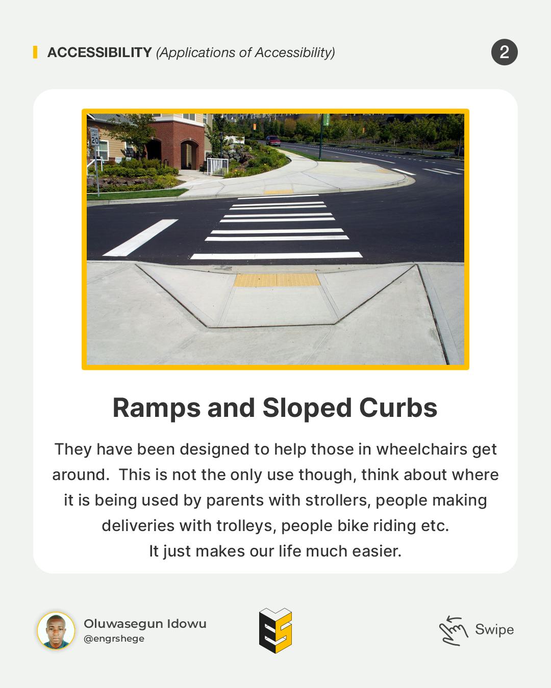
Push to Open Buttons
They are installed in most stores or places to aid people in wheelchairs. It helps every other person too. Take for instance when you have too many bags to carry or a child that can't muster the strength to open the door by themselves. Also, sometimes it's just easier to use one.
We shouldn't have the mindset that accessibility is a checklist or a set of requirements, but it should be ingrained in how we design. We should be designing for all people.
Assistive Technologies
When people come to our site to use our products, those with disabilities are typically using what is called assistive technology, whether that's a device or software.
There is a wide range of Assistive Technologies that are important to understand because it's going to open our minds to some of the ways that people are interacting with our content and the user experience that we are creating online.
Examples of Assistive Technologies:
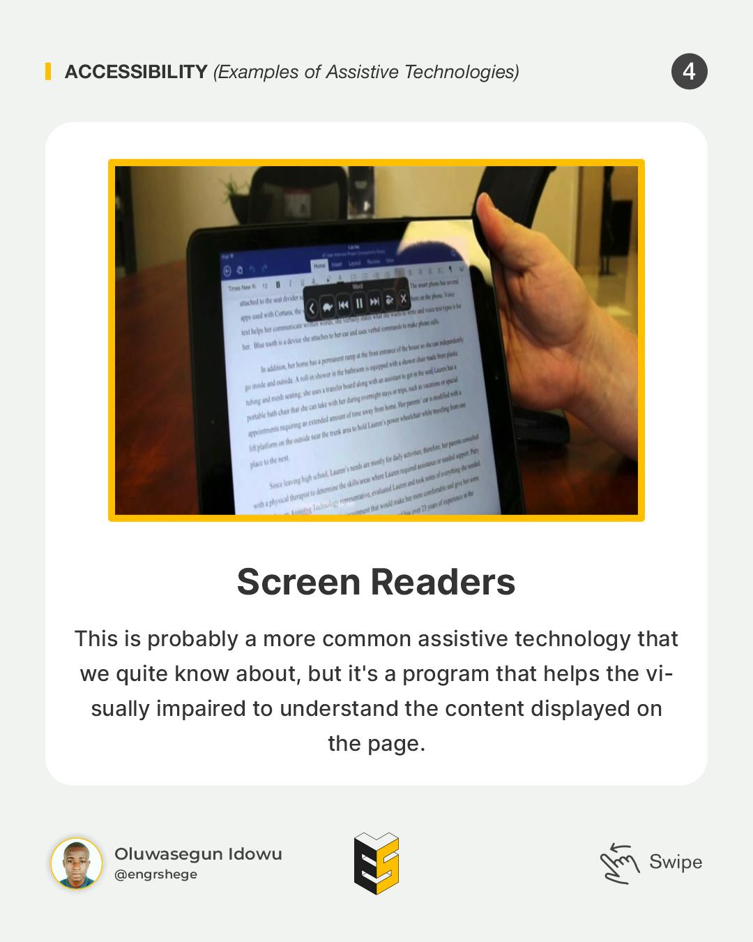
Screen Readers
This is probably a more common assistive technology that we quite know about, but it's a program that helps the visually impaired understand the content displayed on the page. So, it converts digital text, labels, images and descriptions to something more readable by this piece of software.
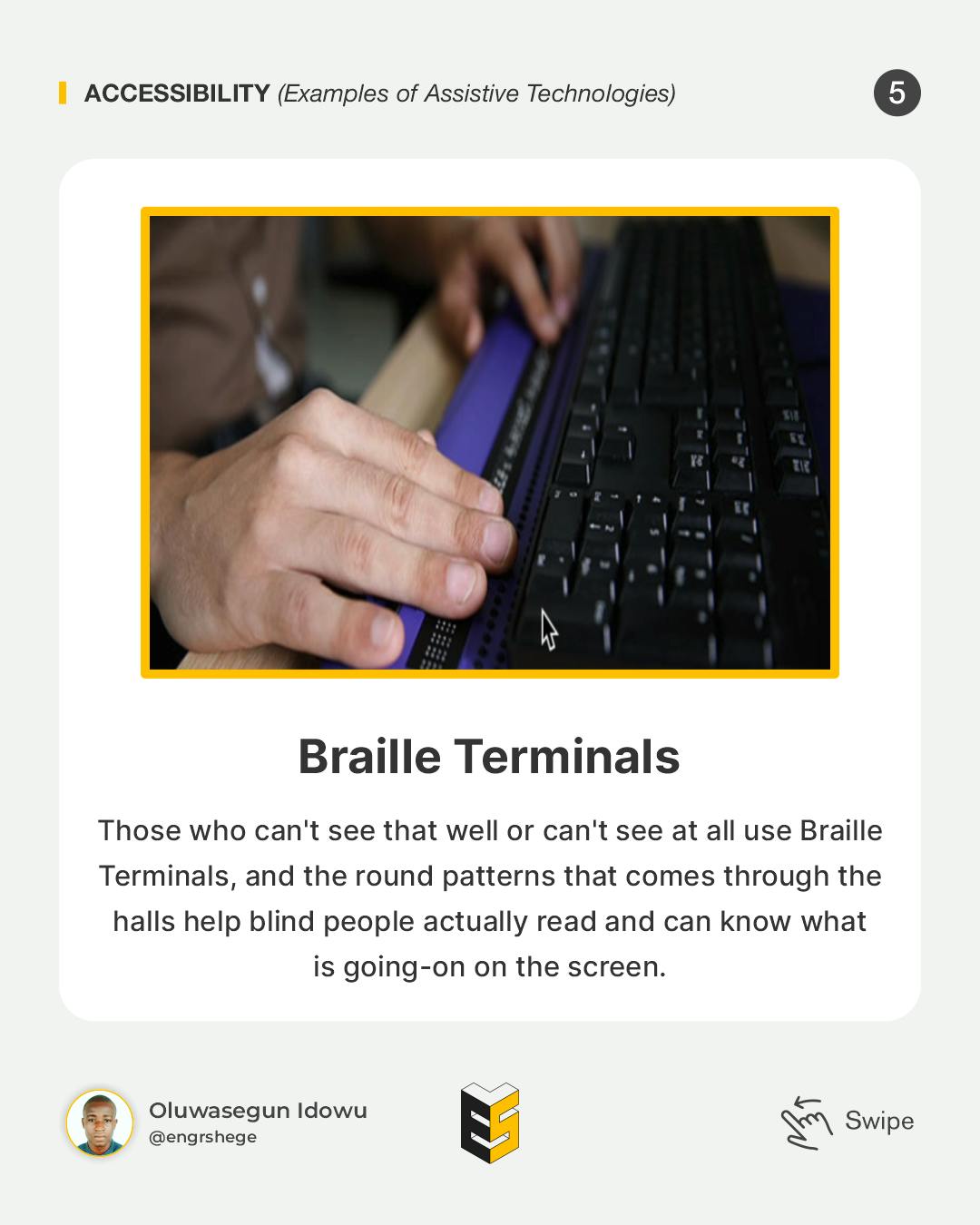
Braille Terminals
Those who can't see that well or can't see at all use Braille Terminals and the round patterns that come through the halls help blind people read and can know what is going-on on the screen.
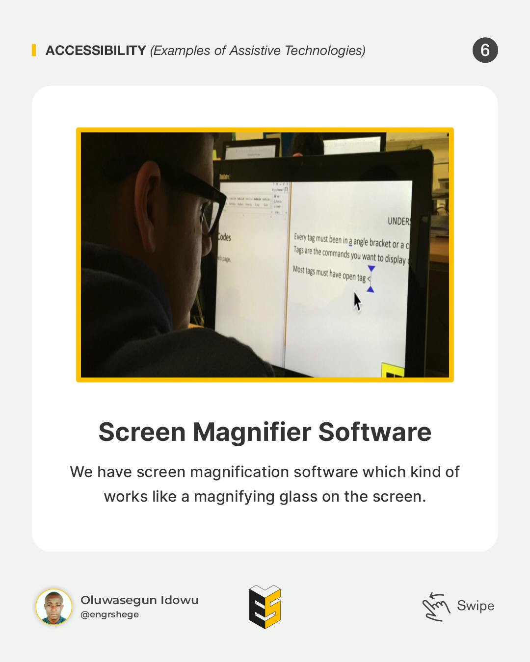
Screen Magnifier Software
We have screen magnification software which kind of works like a magnifying glass on the screen.
Alternate Input Devices + Software
This is a Speech Input Device, which is a lot different than Alexa or Google Assistant, but basically, it allows people to control the computer with their voice.
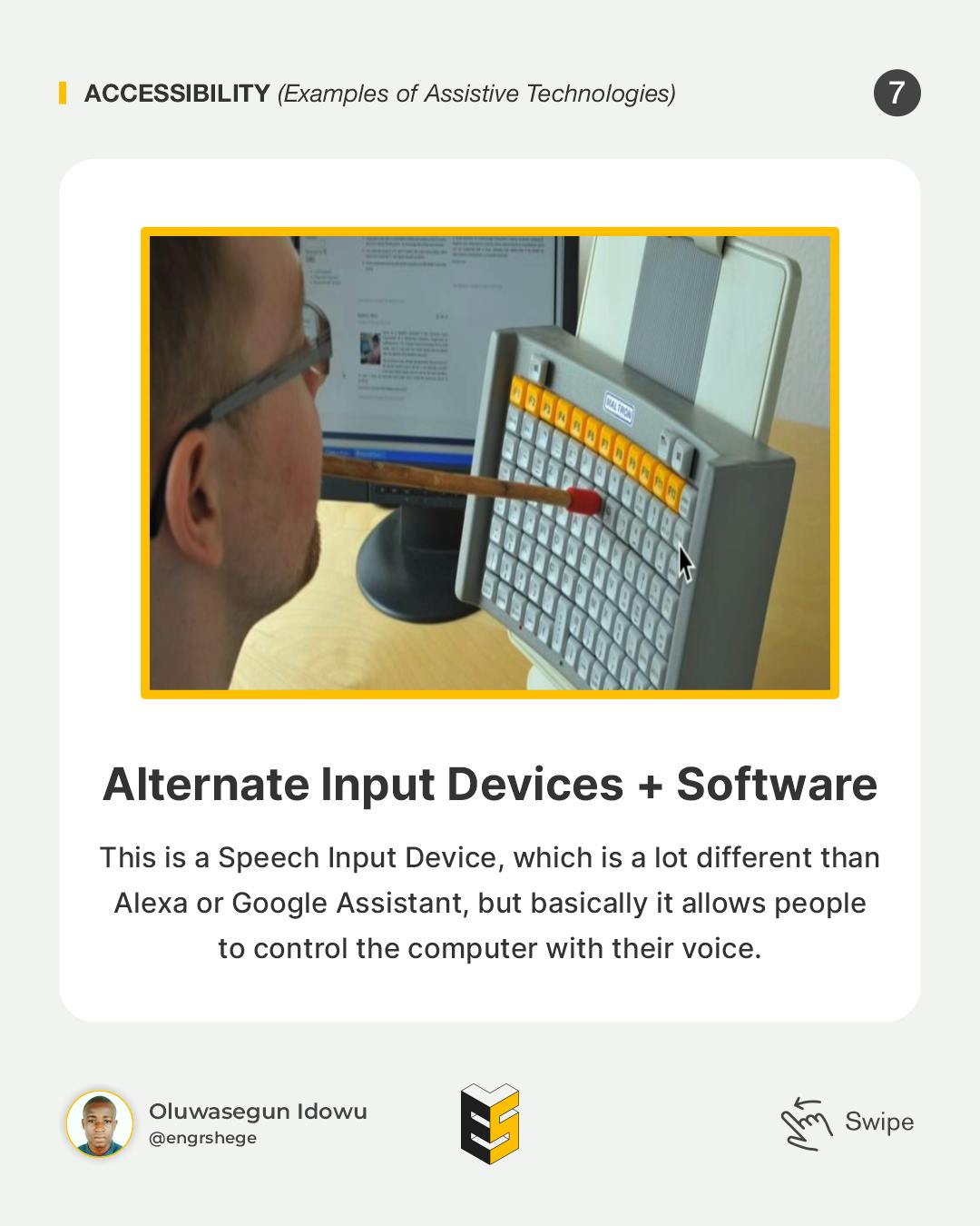
There are also devices like we see here with the keyboard and the gentleman using a stick to type. So once again, we need to take into account all the different ways people are interacting with our website because it will affect the way we approach designing and developing it.
Visual Patterns for Accessibility - (Part 1)
As designers, there are several things we can do to make our designs accessible.
Also, there are things we can do as designers to influence developers to ensure that our products or live products are accessible.
The first thing is Colour Contrast.
Colour Contrast
This is the first step towards an accessible UI and it is to get the color contrast for your product right.
Colour contrast is a really important part when it comes to visual impairments. Getting this right will help those with visual impairments to see and to discern information on the screen.
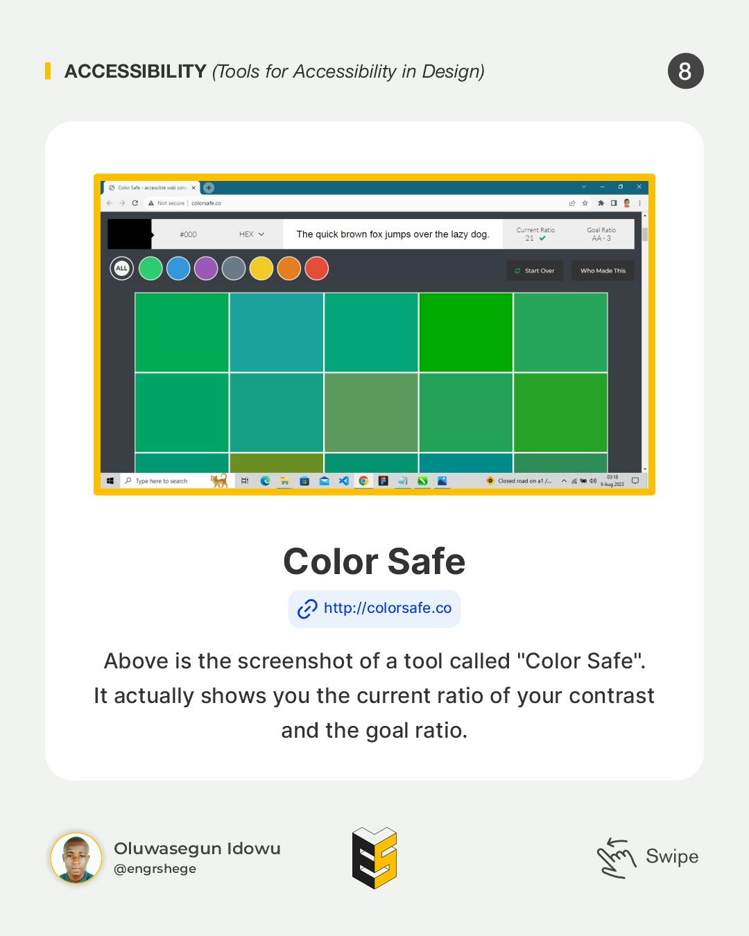
Above is the screenshot of a tool called "Color Safe". It shows you the current ratio of your contract and the goal ratio.
Note:
Larger Font is categorized as any font larger than 18px when bold or larger than 24px for regular font weight.
Small Text is anything smaller than 18px.
Tools for Accessibility in Design.
Color Safe
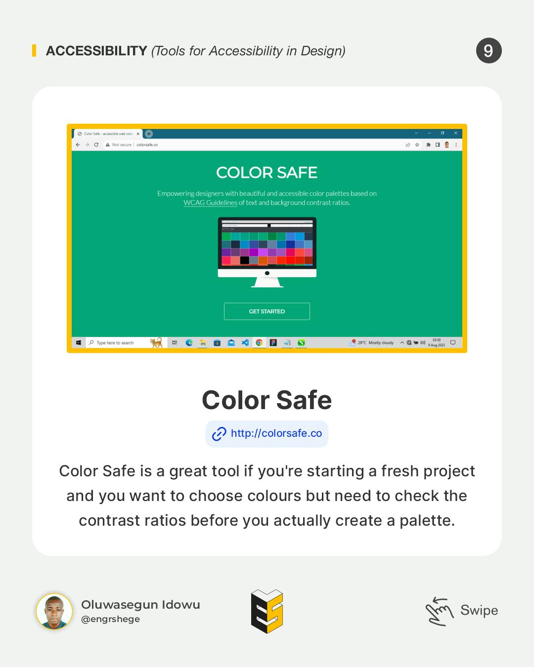
Color Safe is a great tool if you're starting a fresh project and you want to choose colours but need to check the contrast ratios before you create a pallet.
Colorable
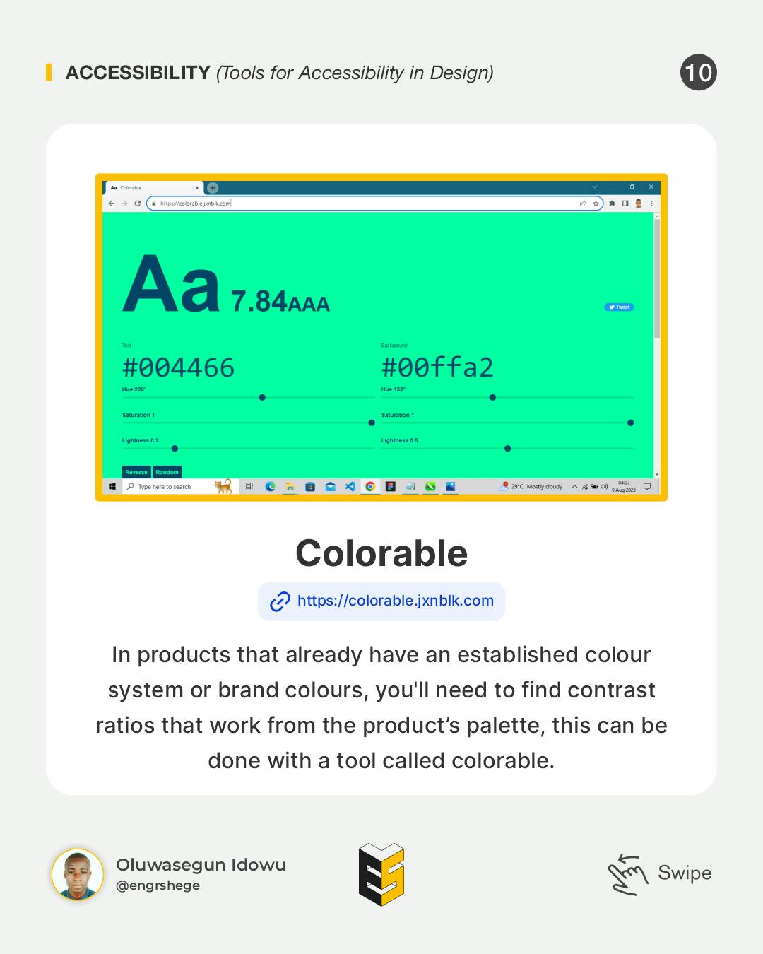
In products that already have an established colour system or set up brand colours, you'll need to find contrast ratios that work from the product's palette, this can be done with a tool called colorable.
Contrast
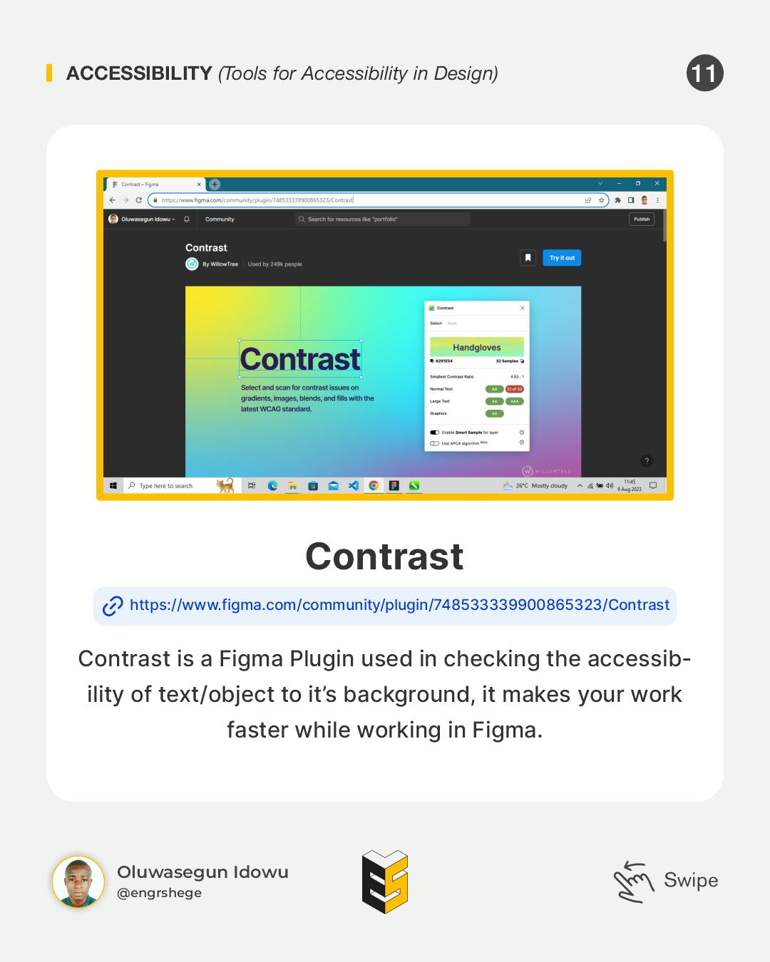
Contrast is a Figma Plugin used in checking the accessibility of text/objects to the background, it makes your workflow faster while working in Figma.
There are alternate ways to improve contrasts.
Sometimes, it can be a large task to check each of your foreground and background colour combinations.
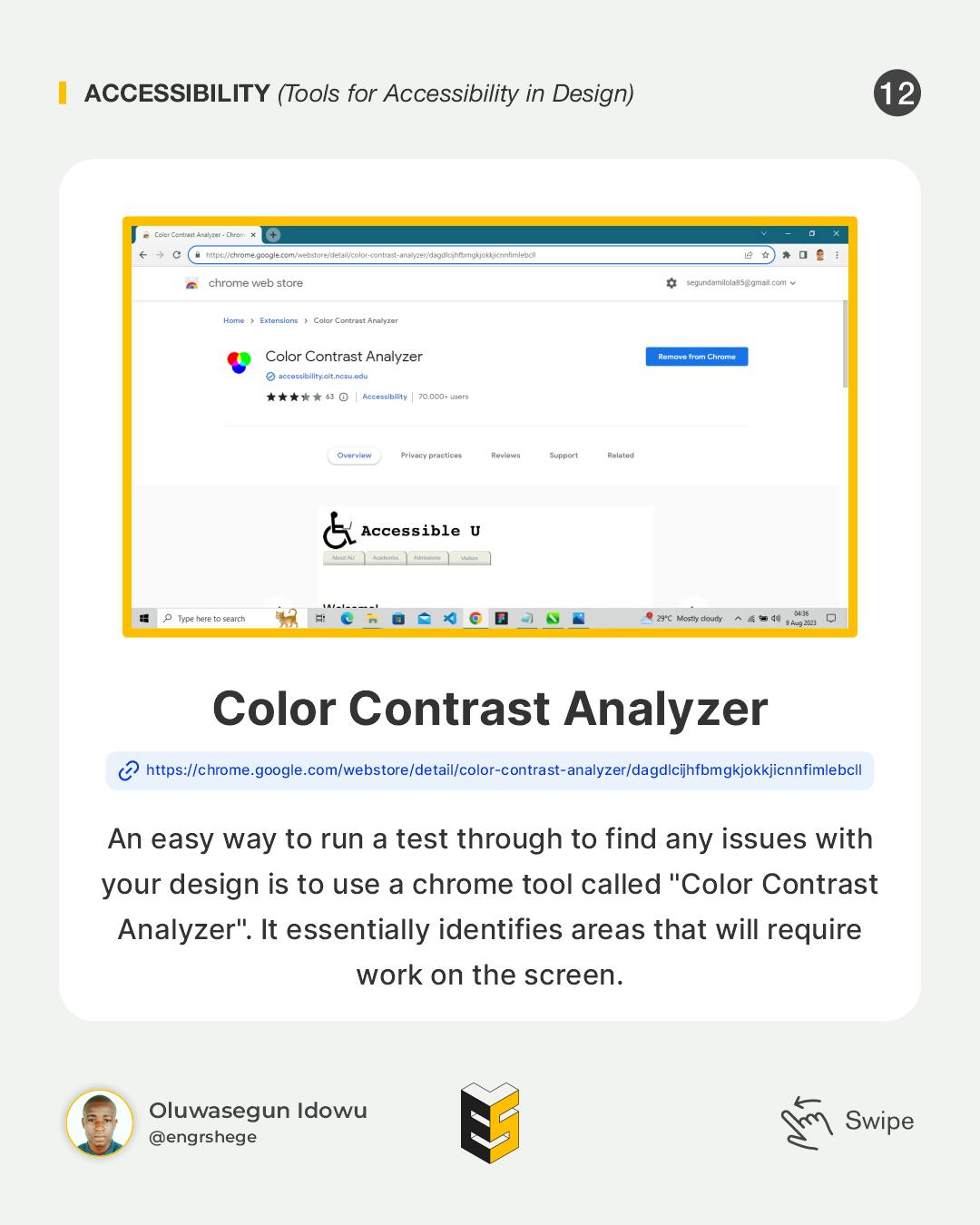
An easy way to run a test to find any issues with your designs is to use a Chrome extension tool called "Color Contrast Analyzer". It essentially identifies areas that will require work on the screen.
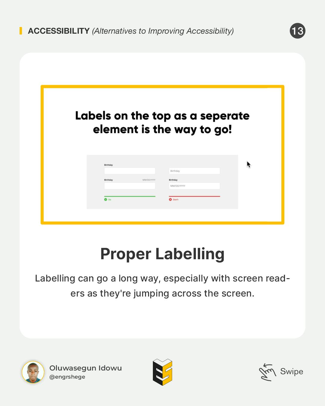
Another thing to do is "Proper Labeling".
Labelling can go a long way, especially with screen readers as they're jumping across the screen.
Visual Patterns for Accessibility - (Part 2)
Focus States
Focus States is one of the important features that enable users to use a computer with just a keyboard. Keyboard users will know what Element they are interacting with because of the help of the Focus Styles.
Focus Highlighting is only used for interactive UI Elements like Form Elements and Buttons, so we need to make sure we keep that intact in there always.
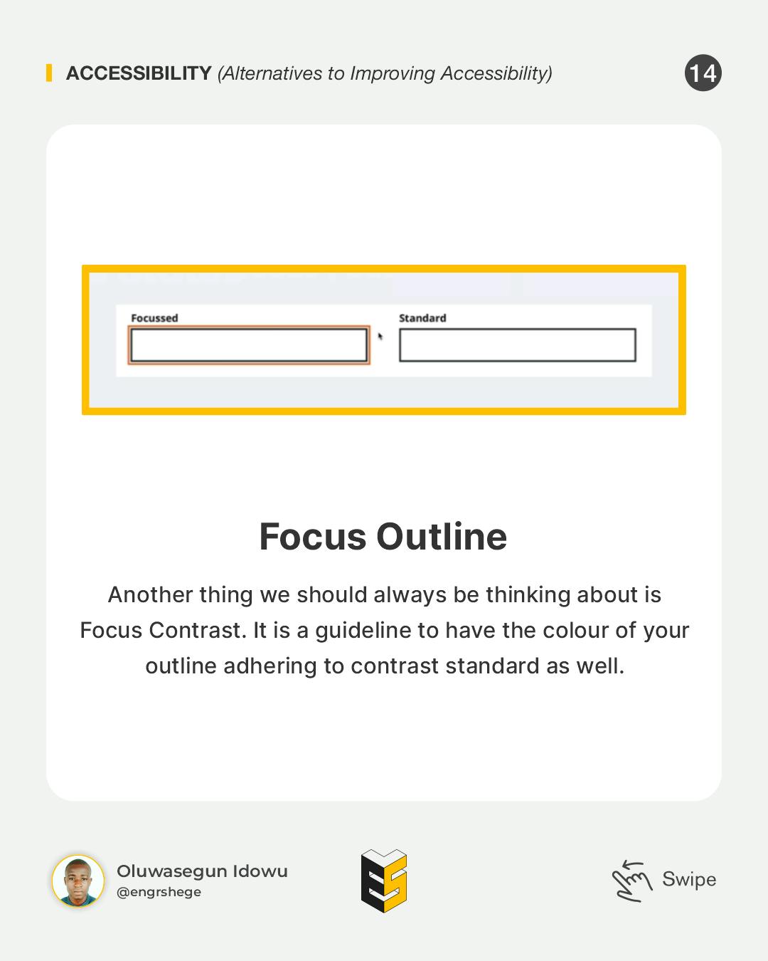
Another thing we should always be thinking about is Focus Contrast. It is a guideline to have the colour of your Outline adhere to contrast standards as well.
Accessibility should be a part of the design process earlier and every UI Element and Design pattern should be made accessible.
Most importantly, as a designer, you should always collaborate with your development team. Accessibility is something we all can work towards and do. It certainly starts with design in terms of style like Contrast, Labels, Forms and all that kind of stuff. But a lot of what happens in terms of specifications will happen on the development side, so it is always important to talk to developers because they are going to have a much deeper understanding of what's necessary. Plus, they can inform you and help you along the way.
The journey gets better...
#Figma #ProductDesign #UIUXDesign #UIUX #UIUXCourse #Branding #BrandStrategy #UIElement #Accessibility #Udemy #UdemyCourses #ZTM #ZeroToMastery #DocumentingMyTechJourney #BuildingMySkillset #TechSkill #SkillSets #ProductDesigner #EngrShege #ES